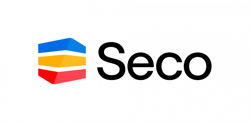
Cutting tool supplier Seco is introducing a drastically updated visual identity alongside a long-term brand strategy. The company is describing the move as the first in a sequence of major steps as the business positions itself as a global name for industry innovation, efficiency and sustainability. There was a lot of heritage in the old logo, with this update being what people notice first with the new branding. The new logo is an evolution of the old one, built on the company’s iconic colours, because being bright and positive is a huge part of Seco’s identity.
For further information www.secotools.com


