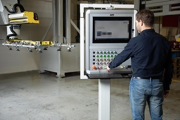
AP&T has produced a new generation control system that is designed to simplify the utilisation of presses, automation equipment and production lines. The upgrade entails a comprehensive overhaul of the LOGOS user interface, as well as functionality and hardware.

“Our ambition is to make operation as simple as possible for everyone who uses our machinery on a day-to-day basis,” says AP&T vice CTO Christer Bäckdahl. “Consequently, we have listened very carefully to the opinions of customers and operators, and worked to satisfy their wishes in our development work. At the same time, we have put a great deal of effort into ensuring that operators who are accustomed to our machinery will feel at home in the environment.”
One thing that many users have asked for is larger screens. Now, operators have access to 22” screens with full HD for stationary PCs and 7” screens for hand-held mobile panels. Both have widescreen format (16:9) and high resolution. The number of pixels is 2.5 times higher than previously, while the graphics, which present a clear AP&T identity, have been developed to give a good overview of the displayed information and to facilitate navigation. This feature applies to the alarm view, for example, which gives a quick overview of the machine’s status.
The functionality itself has also been improved, at least according to Lars Prysander, who has been the development project manager and one of the programmers for the new system version.
“One of the many examples is that previously two clicks were needed to switch between the various machines connected to the system,” he says. “However, we’ve now added an extra menu with shortcut keys, which means only a single click is needed to switch from one unit to another.”
For further information www.aptgroup.com


